
Have you ever experienced the frustration of encountering a website with a navigation menu that leaves you feeling lost? Despite your attempts to click on menu items that should logically lead you to your desired product or page, you find yourself navigating through a confusing maze, unable to reach your destination.
You aren’t alone. Everyone has had a fair share of encounters with perplexing navigation menus on websites. A confusing navigation menu can quickly turn what should be a seamless and enjoyable browsing experience into a frustrating ordeal.
When a navigation menu falls short, it's a missed opportunity to make a positive first impression and keep visitors engaged. A well-designed navigation menu is like a friendly guide, eager to show you around and help you discover what you're looking for.
In this blog, we’ll cover ten best practices and tips for website navigation menu design. Join us as we discover ways to design an intuitive, clear, efficient, and responsive navigation menu.
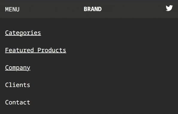
1. Start with a site map
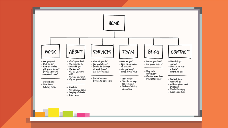
A site map is a blueprint that sets the groundwork for a user-friendly website and guides visitors through your website’s offerings. But why do you need to look into your website’s sitemap to design your navigation menu? Let’s quickly take you through it.
Organised content hierarchy
A website’s site map outlines the relationships between different pages, sections, and categories. This site map forms the basis for your navigation menu, ensuring it accurately reflects the logical flow of information.
Seamless user experience
When users arrive on your website, they have specific goals and expectations. A well-structured site map enables you to design a navigation menu that aligns with these user needs.
Identification of gaps and redundancies
A site map allows you to identify potential gaps in your content strategy. Are there missing pages or sections that users might expect to find? Conversely, are there redundant pages that could confuse visitors? You can fill these gaps while deciding on your navigation menu.
Intuitive information architecture
With a site map, you can establish a clear and intuitive navigation menu that helps users understand where they are within your website and how to navigate to other relevant sections.
A website with a clear menu leads to faster information retrieval for users. So, set your eyes on the sitemap first before you decide on your website’s navigation menu.
2. Focus on user needs
When everything on your website is focused on user needs, why not the navigation menu? It serves as the gateway to your website’s content. So, you need to ensure that your navigation menu offers users a satisfying experience. Here are some strategies for designing a navigation menu that focuses on your user's needs.
User research
Conduct thorough user research to understand your audience's preferences, behaviors, and pain points. This insight will guide your menu design and content organization.
User personas
Create user personas that reflect different segments of your target audience. This helps you create a menu that caters to the diverse needs and goals of your users.
Prioritize key content
Identify the most sought-after content or actions and ensure they are prominently featured in your navigation menu. This might include popular product categories, services, or contact information.
Insert search feature
Integrating a search feature within the top navigation menu provides users with a swift and direct pathway to finding precisely what they seek.
User testing
Regularly test your navigation menu with real users to gather feedback and identify areas for improvement. It helps to uncover issues that may not be immediately apparent during the design phase.
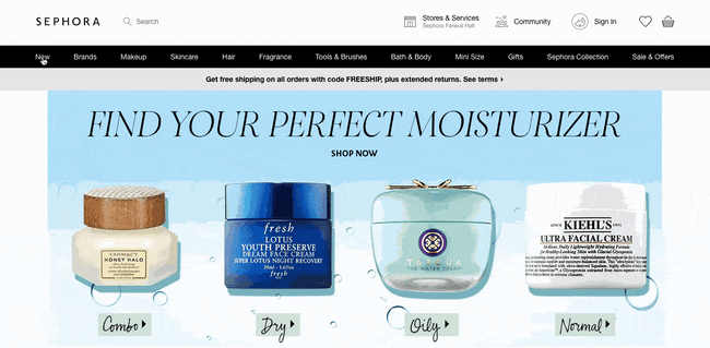
Apple's website exemplifies simplicity and elegance. Its navigation menu presents key options, ensuring visitors can swiftly access vital sections. By designing your navigation menu to meet user expectations, you create an environment where users feel encouraged to explore more and engage with your website.
3. Use clear menu titles
Your website’s navigation menu is often the first point of contact between users and your content. So, it is essential that you keep the menu titles clear and concise to help users quickly grasp the purpose of each menu item and navigate your site with ease. Here are some tips for designing clear menu titles.
Steer clear of technical terms
While technical jargon might make sense to you, it could be confusing or meaningless to your visitors. Opt for terms that are universally understood, especially if your target audience includes people outside your field.
Prioritize simplicity
Keep menu titles simple and straightforward. Remember that users are looking for a quick way to access information, so avoid convoluted language or phrases that require interpretation.
Be specific
Vague or generic terms like "Services" or "Products" may not provide enough context. Instead, use specific titles that convey the nature of the content, such as "Web Design Services" or "Running Shoes Collection."
Airbnb employs a clear and visually appealing navigation menu with concise labels, enabling users to seamlessly explore various accommodations and experiences. Users are more likely to engage with your website when they can quickly identify menu items that match their interests. By focusing on clear menu titles, you’re aligning with user needs, thus increasing the likelihood of users achieving their website visit goals.
4. Limit menu items
We cannot stress enough that simplicity is the key to web design. And it holds true for the navigation menu too. Though you may be tempted to showcase every aspect of your website, overloading your menu can lead to decision fatigue for users. When confronted with too many options, they become indecisive and abandon the website altogether.
So, here we are. Try these tips to limit the number of menu items in your navigation menu, be it the header or the footer.
Prioritize key pages
Identify the most important and frequently accessed pages on your website. These could be your homepage, product/service pages, contact page, or any other sections that align with your primary business goals.
Group related content
Categorize similar or related content under broader menu headings. For instance, if you have multiple shirt categories, create a single menu item called "Shirts" that leads to submenus or landing pages for each category.
Combine subpages
If you have multiple subpages within a category, consider combining them into a single menu item. For instance, if you offer various services, you can create a "Services" menu item that leads to a page where users can explore different service offerings.
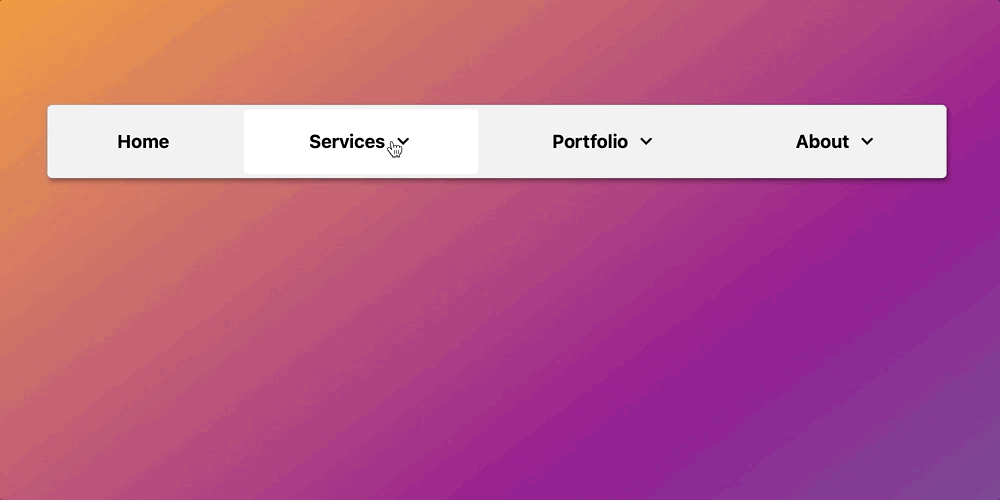
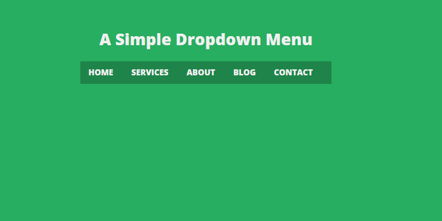
Use dropdown menus
Dropdown menus allow you to include more content without overwhelming users. However, exercise caution and avoid excessively deep dropdowns, as they can become cumbersome and confusing. Stick to one or two levels of dropdowns to maintain simplicity.
Focus on the user's needs and consider what information deserves a spot on the navigation menu.
Pro Tip: A study by the Nielsen Norman Group found that users often scan navigation menus in an "F"-shaped pattern, focusing more on the left side. Placing key menu items strategically within this pattern can increase their visibility and effectiveness.5. Utilize hierarchical structure
What is the best way to showcase enough website content through menu items on the navigation menu while keeping it user-friendly? You can achieve it by using hierarchical menu items. This approach, often achieved through dropdowns, organizes your content into logical tiers, allowing users to effortlessly explore various subcategories. Let’s get some insight into the benefits of using hierarchical dropdown menus.
Categorization and clarity
Hierarchical menus group related content into broader categories. This provides a clear overview of the available information and also helps users understand the relationships between different sections of your website.
Conserved screen space
Hierarchical menus conserve valuable screen space. By condensing subcategories within dropdowns, you maintain a clean and uncluttered design, which is particularly crucial for mobile layouts.
Quick access to subcategories
Users seeking specific information can swiftly access their desired subcategories through dropdowns, eliminating the need to navigate through a series of intermediary pages.
Intuitive exploration
Hierarchical menus follow the natural patterns of human thinking. It minimizes the number of clicks required, enabling users to directly access the desired subcategory.
Reduced cognitive load
Dropdown menus allow you to present a comprehensive list of subcategories without overwhelming users. They can focus on the main menu items and explore relevant options when they need them.
A point to note is that while hierarchy is beneficial, avoid creating overly deep dropdowns and complex structures. That takes us to our next tip for website navigation menu design.
6. Don’t use more than two menu levels in the top navigation menu
We have already told you about the benefits of logical hierarchy and dropdown menus. But excessive levels can create confusion and hinder user engagement. Abide by the “two-level rule”, limiting your top navigation menu to a maximum of two levels. Here’s how you can achieve it.
Prioritize content hierarchy
Carefully prioritize your menu items, placing the most important and frequently accessed content at the top. This ensures that users can quickly find what they're looking for without delving into multiple levels.
Concise labels
Choose clear and concise labels for your menu items. Ambiguous or lengthy labels can confuse users and hinder their ability to navigate effectively.
Use mega-menus wisely
If your content demands a more intricate organization, consider implementing mega menus – large, multi-column dropdowns. These allow you to present multiple options within a single dropdown, reducing the need for additional menu levels.
Users get navigational clarity when presented with a streamlined and simpler navigation menu. It can also significantly increase conversions by 20%.
Start Creating Your Website Now
7. Add a call-to-action button in the top menu
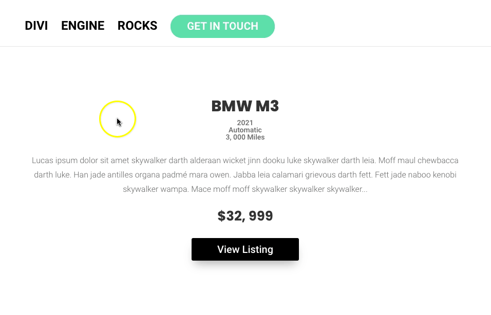
You very well know that click-through rates for top organic positions are much higher than those for other positions on a search engine results page. This highlights the importance of prime positioning. The same logic holds true for a CTA in the top menu. Placing a CTA button here ensures that it’s among the first elements users encounter upon arriving on your website. This may prompt them to take action without requiring extensive scrolling.
Here are a few tips for the strategic placement and design of your CTA in the top menu.
Prominent positioning
Position the CTA button within the top menu, preferably aligned with other primary menu items. Placing it near the center or on one side of the menu draws attention while maintaining a cohesive design.
Contrasting visuals
Design the CTA button to stand out from other menu items. Utilize contrasting colors, bold typography, or an eye-catching icon to ensure that the button is visually distinct and easily recognizable.
Clear and actionable copy
Craft concise and actionable text for the CTA button. Use phrases that encourage immediate action, such as "Get Started," "Explore Now," or "Join Us."
A study has found that adding a CTA button to navigation menus increased conversions by 22%. So, why not experiment with a CTA button in your top navigation menu and see if it has a significant impact on engagement and conversion metrics?
8. Experiment with sticky top navigation menus
How do you ensure that the top navigation menu is consistently accessible to the user, no matter where they are on the webpage? A sticky menu ensures that the navigation menu remains visible as users scroll down the page, simplifying user interactions and boosting conversions.
Here are some considerations for a sticky navigation menu.
Subtle design
While the goal is to provide continuous access, the sticky menu should be designed in a way that doesn't dominate the user's view. It should remain unobtrusive and complement the overall design aesthetic.
Responsive behavior
Ensure that the sticky menu functions seamlessly on both desktop and mobile devices. Responsive design ensures a consistent and user-friendly experience across various screen sizes.
For sure, a sticky menu reduces friction in the user journey. Users can quickly access important sections or CTAs without interrupting their scrolling, potentially leading to higher engagement and conversions.
9. Make your menu mobile-responsive
The responsiveness of your website's navigation menu to various screen sizes and orientations is not just a design choice; it's a necessity. It guarantees that users can access your content effortlessly, regardless of the device they're using. Then there is an SEO connection too. Google primarily uses the mobile version of the content for indexing and ranking. A mobile-responsive navigation menu ensures that both desktop and mobile users have access to the same content, aligning with Google's indexing approach and influencing your site’s SEO performance.
How do you implement mobile-responsive navigation? We’ve got you covered with some design tips.
Design for touch interaction
Consider touch-friendly elements for mobile navigation, such as larger tap targets, well-spaced menu items, and easily accessible dropdowns. This enhances usability and prevents accidental clicks.
Prioritize essential items
Due to limited screen space on mobile devices, prioritize the most crucial menu items for the mobile version. Streamline the menu to showcase core content and actions that align with mobile users' needs.
And remember, users interact differently with websites on mobile devices compared to desktops. So, make sure that your mobile-responsive navigation menu design aligns with mobile-specific user behavior, ensuring a smooth and intuitive browsing experience.
10. Maintain visual consistency and branding
Your navigation menu contributes to conveying your brand’s essence as much as other elements on your website. A visually consistent navigation menu contributes to a cohesive user experience. Users feel guided and reassured as they navigate your website, fostering a sense of familiarity and comfort.
Here’s how to maintain consistency in typography, color schemes, and design elements to design a navigation menu that aligns with your brand’s aesthetics.
Font choice
Utilize consistent typography that mirrors your brand's personality and values. The font you choose communicates a distinct tone , whether it's playful, professional, or minimalist.
Font hierarchy
Maintain a consistent hierarchy of font styles (e.g., headings, subheadings, and body text) across your navigation menu and the rest of your website.
Brand colors
Infuse your brand's signature colors into your navigation menu. This creates a visual connection between your menu and the rest of your website.
Color psychology
Leverage color psychology to evoke specific emotions or actions. For example, vibrant colors might encourage excitement, while muted tones promote a sense of calm.
Icons and imagery
If your brand incorporates icons or imagery, integrate them into your navigation menu design as well to enhance visual appeal and further align the menu with your brand.
Whitespace and layout
Maintain a consistent balance of whitespace and layout within your navigation menu.
A visually consistent navigation menu conveys a sense of professionalism and attention to detail. It reinforces your brand identity , fostering a sense of familiarity and comfort.
Conclusion
Don’t go overboard when designing your navigation menu. Prioritize simplicity, embrace user-centered design, and ensure that every click takes users exactly where they want to go. And if you need help, no-code technology is here to simplify the process of designing an effective navigation menu.
The no-code website builder Dotcom offers a user-friendly platform with customizable header and footer widgets and navigation menu elements to let users effortlessly create a well-structured menu tailored to their content hierarchy. This no-code drag-and-drop builder eliminates the need for complex coding, enabling quick adjustments and real-time previews, ensuring a seamless and visually appealing navigation experience for visitors.
Leverage the no-code web builder Dotcom to build a website that has a well-crafted navigation menu , which makes all the difference!