
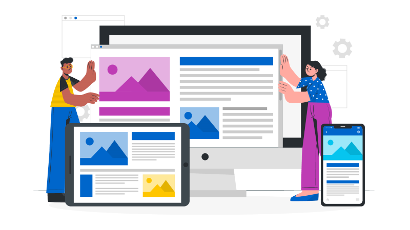
Having a responsive website has become a must for every website in this world of ever-evolving technology. New devices sprouting up every day. With the proliferation of smartphones, tablets, and a wide array of screen sizes, one cannot deny the expectation of users when it is to the websites’ ability to adapt seamlessly to their devices. It is a normal requirement. On the contrary, having a non-responsive website will actually demerit the credibility and quality of the website.
It is where responsive design comes into play, ensuring that websites look and function beautifully on any screen and browser type. And while responsive design used to be the realm of web development experts, drag-and-drop website builders like Dotcom have democratized this essential skill, making it accessible to anyone. In this blog post, we'll delve into the fundamentals of responsive design in drag-and-drop website builders.
Responsive Design - An Overview

Responsive web design is an approach that has the main objective to provide an optimal viewing experience across a wide range of devices and screen sizes. The core idea behind responsive design is to ensure that your website's layout, images, and other elements adapt gracefully to the device on which it is being viewed.
Before the origin of this concept, the design of websites remained the same across the devices available. However, a pragmatic shift occurred in 2010. An article was posted by Ethan Marcotte who was a web designer and web developer. He coined the term in his article which eventually led to the idea of creating mobile-first web designs.
In drag-and-drop website builders like Dotcom, this means that you can create websites that look just as good on a large desktop monitor as they do on a medium-sized tablet or a small smartphone screen without the need to write complex code.
Responsive design is built on several key principles:
1. Fluid Grids: A fluid grid system is the backbone of responsive design. In drag-and-drop builders, you can easily set up grids, which act as the framework for your site's layout. These grids are designed to be flexible, allowing you to divide your content into rows and columns that can adapt to different screen sizes.
2. Flexible Images and Media: Responsive design requires images and media elements to be flexible as well. You can configure these elements to scale proportionally within their containers, ensuring that they don't break the layout on smaller screens or become oversized on larger ones.
3. Media Queries: Media queries are CSS techniques that enable you to apply specific styles based on the characteristics of the user's device. They allow you to define breakpoints, which are specific screen widths or device orientations at which your design adjusts. For example, you might have a breakpoint for screens smaller than 768 pixels wide (typical for tablets) and another for screens larger than 1200 pixels. It is typical for desktops.
Importance of Responsive Design

If you are considering responsive design as a mere concept of making the website device-friendly, then that is wrong. In fact, you can reap a number of benefits by creating a responsive design. Here, we have listed the significance of having a responsive design.
1. Optimal User Experience
Users expect websites to be easy to navigate and view, irrespective of the device they're using. Responsive design ensures that your website provides a seamless experience, which can lead to increased user satisfaction and engagement rate.
2. Improved SEO
Search engines like Google give precedence to mobile-friendly websites in their rankings. Having a responsive site can improve your search engine rankings, potentially increasing your organic traffic, ultimately your conversion rate.
3. Broader Audience Reach
With responsive design, you can reach a wider audience. Your site will look and function well on a variety of devices, including smartphones, tablets, laptops, and desktop computers. It should also be compatible across different browsers. This will take your website to new heights and new audience groups.
4. Future-Proofing
As new devices with different screen sizes and resolutions continue to emerge, responsive design future-proofs your website. It ensures that your site remains accessible and functional regardless of the changes in technology. It will also bring down the number of iterations needed.
Start Creating Your Website Now
Responsive Design in Drag-and-Drop Website Builders
Responsive design in drag-and-drop website builders like Dotcom is made accessible through user-friendly interfaces that abstract the technical complexities. Responsive design within drag-and-drop website builders represents a powerful toolset for creating websites that automatically adjust to diverse screen sizes and devices. Here, we'll delve deeper into the specific features and aspects you should be aware of.
1. Flexible Grid Systems
In drag-and-drop builders like Dotcom, you can create and customize grid systems with ease. These grids allow you to structure your page into rows and columns, providing a well-organized layout.
Rows: Think of rows as containers for your content. They enable you to add various elements like text, images, and videos. The flexibility to add or remove rows and adjust their layout is central to responsive design in drag-and-drop builders.
Columns: Columns are used to organize your content horizontally within a row. You can customize column widths and their order to accommodate different screen sizes.
2. Relative Units and Fluid Layouts
Responsive design depends on using relative units like percentages and ems instead of fixed pixel values. This ensures that elements scale proportionally to the screen size.
Percentages: Elements can be set to occupy a specific percentage of their container's width or height. For example, you can specify that an image should take up 30% of its containing column.
Ems: Typography is another critical element in responsive design. You can define text elements using ems, allowing text to scale with the user's chosen font size, and maintaining readability on various devices.
3. Media Queries
Media queries are the secret sauce of responsive design. They enable you to apply CSS rules conditionally based on screen characteristics like width, height, or device orientation.
Breakpoints: Breakpoints are specific screen widths at which your design changes. For example, you might design your content to look and function optimally at three breakpoints: one for smartphones, one for tablets, and one for desktops. When the screen width matches a defined breakpoint, the associated styles are applied.
4. Preview and Testing
Most drag-and-drop website builders provide built-in features for previewing and testing your site on different devices. This is crucial for identifying and addressing any issues before you publish your site.
By using these features, you can visualize how your website will appear on various devices, make necessary adjustments, and ensure that your responsive design is working as intended. For instance, Dotcom lets you preview the design across different devices to ensure 100% optimization.
5. Pre-built Responsive Templates
Many drag-and-drop website builders offer a diverse library of pre-designed templates, and these templates are often inherently responsive. They've been carefully crafted to ensure that your website looks and functions impeccably on various devices. When you select a responsive template, you're essentially starting your design journey with a robust foundation for your site's layout and design.
Moreover, these templates usually cover a wide range of industries and styles, allowing you to find one that aligns closely with your brand and content. Customizing these templates is as simple as dragging and dropping elements onto the canvas and adjusting their properties.
6. Drag-and-Drop Elements
A hallmark of drag-and-drop website builders is their extensive collection of responsive elements. These elements encompass text boxes, videos, images, buttons, forms, and more, all configured to adapt gracefully to different screen sizes. You can effortlessly fine-tune their appearance and behavior, ensuring that your website looks polished and functions seamlessly on a variety of devices.
By allowing you to simply drag and drop these elements onto your canvas, these builders simplify the responsive design process, eliminating the need for coding or advanced technical skills.
7. Mobile Editing Modes
To facilitate control at the grass-root level over the mobile experience, drag-and-drop builders often offer dedicated mobile editing modes. These modes enable you to make specific adjustments to the appearance and layout of your site when viewed on mobile devices. For instance, you can tweak font sizes, hide or rearrange elements, and ensure that your site delivers an optimized experience on smaller screens.
This level of control ensures that your site isn't just responsive but provides an exceptional user experience on mobile devices, which are increasingly prevalent among website visitors.
8. Cross-Browser Compatibility
Responsive design isn't limited to screen size alone; it also encompasses compatibility with different web browsers. Drag-and-drop builders typically generate code optimized for compatibility with major browsers like Chrome, Firefox, Safari, and Edge.
It ensures that your site's appearance and functionality remain consistent across diverse browsers, irrespective of your visitors' choices. So, you will not leave out your target audience across any platform.
9. Real-Time Responsiveness
A significant advantage of using drag-and-drop builders is the ability to witness the responsiveness of your site in real time. As you make changes, such as adjusting elements, modifying grids, or optimizing media, you can instantly see how these adjustments affect your site's appearance on various devices.
This real-time feedback accelerates the fine-tuning of your responsive design, allowing you to refine your site until it meets your exact specifications.
10. Accessibility Considerations
Responsive design is not solely about adapting to various screen sizes; it also falls under the purview of accessibility considerations. Many drag-and-drop builders promote accessible design practices, helping you ensure that your site is usable by individuals with disabilities.
These practices may include providing alternative text for images to aid screen readers, implementing keyboard navigation for those who cannot use a mouse, and offering high-contrast themes to assist users with visual impairments. By incorporating accessibility features, your website becomes inclusive and user-friendly for all.
11. Continuous Updates
Website builders frequently release updates and improvements to their platforms. These updates often include enhancements to responsive design features. By keeping your website builder up to date, you can take advantage of the latest tools and technologies for creating responsive designs.
Regularly checking for updates ensures that your website remains on the cutting edge of responsive design practices and continues to provide the best experience for your visitors.
12. Resources
Most drag-and-drop website builders promote updated support resources. If you encounter challenges with responsive design or have questions about best practices, you can often find guidance and assistance from the official support channels.
Leverage these resources to obtain valuable insights, tips, and solutions to any responsive design hurdles you may encounter during your website creation journey.
Tips for Successful Responsive Design

If you are looking for a few best practices on how to design a successful responsive design, this section will definitely guide you.
1. Plan Your Layouts: Before diving into design, take the time to plan your layouts. Consider how your content will flow on different screen sizes and sketch out your design ideas.
2. Consistent Typography: Choose fonts and font sizes that work well across different devices. Maintain readability by ensuring that your typography scales gracefully.
3. Optimize Images: Images should be compressed and optimized for fast loading on mobile devices while still looking great on larger screens. Use responsive image techniques to serve appropriately sized images.
4. Test Extensively: Testing is vital to a successful responsive design. Try your website on various devices and browsers to ensure a consistent user experience.
5. Stay Updated: Website builders and design trends evolve. Keep your website builder and its templates up to date to take advantage of the latest responsive design tools and features.
Conclusion
Responsive design capabilities integrated into drag-and-drop website builders like Dotcom offer a user-friendly and efficient way to design websites that adapt seamlessly to a multitude of devices and browsers. It is no longer just a nice-to-have feature; it's a necessity in today's digital landscape. Drag-and-drop website builders have made it accessible to a wider audience, enabling individuals and small businesses to create responsive websites. By understanding the fundamentals of responsive design and following best practices, you can ensure that your website looks and functions beautifully on all devices, providing an excellent user experience for your visitors. Start creating responsive websites today with the best drag-and-drop builder Dotcom.