
You've probably heard terms like color scheme trends/patterns in mobile app design & development as smartphones are the best and also the most accessible way to interact with the online realm.
Each year, new smartphone app design color trends emerge, resulting in frequently seeing consistent color schemes among applications appearing concurrently.
Best practices for selecting colors in app design, on the other hand, define some unbreakable, long-lasting principles.
One design principle which has stood the test of time is the simplicity of employing only two or three colors. Red & green have been utilized for so many years that they have been imprinted in our minds to indicate prohibition & permission respectively. Blue relaxes us, but red alerts us.
The incorporation of colors in marketing is based on the research that colors may impact customer behavior. Each year, color palettes seem to express the prevailing mood & feel of what is happening throughout the globe.
Choosing the proper colors for your mobile application design is just as essential as the UX as well as other critical aspects of application development. It is perhaps the next most significant feature of your software after the performance. After the wireframes are completed and the application function is in position, it is the graphics or colors that offer value to the app.
Color palettes are at the core of your mobile design & development, and if they don't appeal to your target customers, the effectiveness of your application may suffer. Users are drawn to high-quality designs because the proper colors create the appropriate brand association. So, how should you go about finding the appropriate color match? Let us investigate.

Color's Significance in UX UI Design
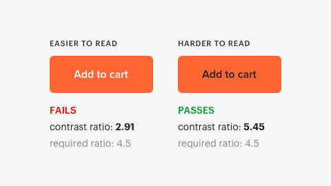
Considering UI UX, the basic thing we can correct without professional assistance is the use of an awful color palette. Hues are crucial; a beautiful composition is constructed around a color scheme that includes complimentary & contrasting colors. It undoubtedly shapes consumers' first impressions. It establishes the tone of the app & encourages visitor interest & involvement. We engage with aesthetic components, and color is vital in these interactions. According to a study, People favor these four colors, according to KISS data. Blues, Greens, Red, & Violet are indeed the colors. They draw over 75% of the populace. They are, of course, the perfect color for mobile applications.
Do you intend to develop a mobile app? Create a featured app in just 30 mins with Swipecart now!
Colors have the uncanny capacity to impact our moods & behavior. Color choices differ from individual to individual and across age categories. When selecting colors for your next smartphone application design, consider the message you would like to express as well as the atmosphere you would like to generate. Because the improper colors may rapidly turn people off, getting them appropriately is critical. Dozens of applications with different color mixes may be found in the app store. The colors of your smartphone app will be determined by the sort of app you wish to design. For a deeper comprehension, we have included a few essential factors that will assist you in properly analyzing colors while selecting your smartphone app color scheme.

1. Understand your target emotions in the audience
Colors elicit emotions, so each hue conveys a distinct meaning. For instance, the color red denotes thrill or stimulus, while the color yellow symbolizes celebration and optimism, the color orange symbolizes readiness with passion, the color blue symbolizes confidence and excellence, as well as the color green, is interested in the environment or riches. Even though there are several more hues, these are the most popular. So, whenever you choose a color for your application, be sure you understand what it means.
Psychologists have studied how colors affect humans and how they relate to human emotions. Popular food businesses, such as KFC, and McDonald's employ red in their logos to stimulate appetite.
The colors silver, gold, black, & white are commonly used in the logos of prestige brands like Armani & Michael Kors.
Consider this while selecting mobile app color themes. Consider the feelings that should occur whenever anyone thinks of your application and brand. Spend some time on this and then choose the appropriate app color.

2. Examine the colors used by your competition in app stores.
The app symbol is merely one aspect of mobile app design. Nevertheless, app icon evaluations in the application store will provide you with a strong starting position for knowing what succeeds in a particular area.
Although if you need to keep to a tried-and-true color pallet, you desire to be noticeable.
You may go beyond new designs by making the color palette easy on the eyes or adding complexity to colors, such as using artificial neural elements.

Colors that stand out vs neutrals
Designers believe that the hue must correspond to the item or the brand directly. For example, if the application seems to be about chocolates, I will undoubtedly utilize particular hues of brown or some other colors that may coincide with the concepts the app symbolizes.
The designer also recommends using neutral colors so that you may focus on information first, particularly when you're creating an application for marketing or commercial deals.
We dug a little more into the matter and came across an intriguing infographic from KISS metrics with several insights on the color chosen for a site or an application. According to the study, when you're developing an app primarily for women, you must choose the hues blue, purple, & green. Avoiding the hues orange, brown, & gray, which are said to be the least favored by women. Men, in contrast, prefer blue, green, & black while despising orange, brown, & violet.

HubSpot did an intriguing color test to determine whether a simple color adjustment from one button may affect conversion sales. The outcome was rather unexpected. Modifying simply the color of the “Get started today buttons” - With the rest of the page remaining the same, it was revealed that perhaps the red button outscored the green one by 21%.

Build An Engaging App For Free
3. Incorporate the fourth C of mobile app design
The three C's of design are consistency, clarity, & content. Whenever selecting colors (the fourth C), keep in mind that they should be complimentary of content & functionality.
Color schemes should be considered in visual interface design. Integrate the color patterns of choice into the user's behavior & workflow. Examine how UI components interact and the way the application fits within the brand, item, & site ecosystems.
4. Begin with the fundamentals
Yes, UI structure, both primary and secondary colors, surfaces vs backdrop, plus expressing via your color selections are all important.
Colors may be used to establish a visual structure of objects with contrasts & continuity. Make a framework and pathways for navigation. Whenever in doubt, go towards simplicity. Maintain vibrant color variations for various functionalities.
The abundance of smartphone app development tools accessible now helps make it simple for creators to combine fundamental guidelines with a little inventiveness to generate new concepts.

5. Don't be scared to deviate from the rules
Google's new application icons have indeed been roundly panned for their clarity issues. Whether or not this criticism is legitimate, the organization has most likely conducted extensive testing & provides a strong justification for selecting this color palette.
Even though it defies the laws of fewer colors & clarity, it adheres to uniformity. Google may have wanted to maintain visibility throughout the user's screen or to boost the brand. For the time being, they are staying with it.
Breaking the rules ought to be done for a useful purpose because trendsetting is usually a positive one.

The significance of colors
For millennia, mankind has indeed been programmed to correlate distinct colors with particular emotions or behaviors. Recognizing such linkages might be quite advantageous to your company. Colors are a powerful instrument. You may reach out to your consumers & trigger emotional reactions, bringing them nearer to the action if you utilize them correctly.
Colors have evolved as well, and their connotations aren't uniform, despite what we may believe. Here are a few examples of how colors differ significantly:
In China, for instance, the color red is associated with good fortune, yet in South Africa, it is associated with grief. Grief is frequently connected with the color black, however, in certain nations, it is represented by the color white, which would be commonly perceived as a hue of hope & purity. When traveling, keep these cultural peculiarities in consideration.
Time: As humans grow, so does our knowledge & interpretation of colors. Red was once seen to be a powerful & manly hue, whilst blue was thought to be a feminine or girly color. We already know that such a notion is no longer relevant.
Shade & hues: Although color has a broad meaning, lighter shades might range considerably from darker hues, and more naturalistic, subdued shades may contrast with synthetic neon colors.
Color possible permutations: Some colors just do not complement one another. Some, on the contrary side, are great buddies. They can complement one another, make one another stand out, mix all together, or clash. Color philosophy may help you figure out which colors go together.
Color & charisma of a brand
Almost all scientific papers on colors and marketing conclude that it is considerably more vital for the brand's hue to complement & co-relate with the brand's personality. The brand's feelings, mood, or appearance all play a part in encouraging the customer to purchase. When colors are utilized to align the brand presence with the product, they play an important role. Take Apple's passion for clean & simple design, noting how white seems to be the ideal hue for their brand.
By employing the same color across all of your company operations, you reinforce the personality of your brand as well as what symbolizes the industry. The following are the most typical places where your branding colors will appear:
Logo
Website
Storefront
Retail design
Jerseys for employees
Advertisements
Avoiding Misconceptions
Colors do not all convey the same meaning to different people. In Western society, for instance, white represents purity and tranquility; it is commonly used during weddings. However, in China, white represents ill luck and is utilized in funerals. Another one to bear in mind while designing your color scheme is that the internet allows you to contact consumers all over the world.
The industry in which your company works. Every type of company has its color palette. The most essential thing to remember is to think about the ideal color for you depending on your situation instead of considering the overall influence of color.
Colors have real power
Color is important in mobile applications developed for a variety of reasons.
- Firstly, they can aid in the creation of a specific atmosphere or vibe within the app. Using a lot of bright colors, for instance, may make the application more enjoyable & vibrant, but darker hues might make it a little more professional and serious.
- Secondly, colors can assist users to navigate the interface. Using various colors for different portions of the application, for instance, can assist users to find their way around. Color coding additional actions (for example, blue for 'firm' & red for 'cancel') can also assist to make things clearer.
-Lastly, colors may make the app more aesthetically appealing & engaging.
This is vital since it will encourage people to return to your application.
So, while building a mobile application, pay close attention to the colors you employ. Color may be used to generate a terrific user experience with enough forethought.


