
Your product page can be both a stopper or a transition point for the customer.
This is an irrefutable fact: If you want to succeed in eCommerce, you must develop outstanding product pages. They are undoubtedly the most significant aspect of the entire internet shopping system.
Well-designed product pages can assist turn visitors into buyers. They also assist in providing your consumers with the details they require to make a smart purchase.
There are several approaches to creating online app product pages. In this post, we'll go over some product page design top practices that you can utilize to enhance your mobile app pages.

Mobile App Product Page Design: 9 Ecommerce Entrepreneurial Tips
Your product pages may make or break your online store. As a result, they must be well-designed. The features listed below should be included in the design of your product pages to render them more appealing to online buyers.
Optimized product description
The most effective thing that your product page has is the product description. This description makes the visitor aware of the product, so it must be scannable and brief. This form of description content has been demonstrated to increase usability by 124%.
To make your material short and simple, incorporate brief key points in your product details for simple reading. Minimal content consists of 1-4 phrases that describe the product. Instead of hyping benefits, objective material describes the product genuinely. Try not to add too much unnecessary information.

Build An Engaging App For Free
Optimize product images
Product images are the very first thing that comes into the sight of the visitor. If the product image is not looking genuine or is not pixel perfect it may repel the user. The most ideal product pages have high-quality photos that showcase the goods in their entirety. You must never skimp on picture quality since it might hurt your sales. Consumers will not purchase a thing if the image is of poor quality or does not adequately reflect it.
People desire a clear picture of how the product will seem in real life. Learning product photography may assist you in capturing visuals that buyers visualize.
Let's look at the stats:
-
Image processing in the human brain is 60,000 times faster than word processing.
-
A visual feature boosts content retention by up to 66%.
-
These would be plenty of reasons to pay close attention to your product photographs.
In this day and age, compelling product photos can tie your user down and continue them on your site for a little longer time. Quality product photography also increases the consumer's trust, which is essential in e-commerce. Because the buyer cannot see the goods in person, product photographs speak for your business.
Pro Tip- You can consider adding 360-degree photos to your product page design to improve the browsing experience. Allowing buyers to upload their product photographs in the review area is also a terrific idea. It enables customers to see what they will receive without the glitter and shine of commercial photography.
Furthermore, if you offer apparel like dresses or shirts, be sure to include a size chart graphic. Customers may view measures & sizes to assist them to determine which is the perfect fit. Use these instructions to convert Asian sizes to US sizes if you're importing from Asia & distributing in the US.

A product picture zoom function also helps buyers to get a better glimpse of your product image. It enables your clients to examine the finer points of a product.
Include an eye-catching call-to-action
CTA Buttons are frequently overlooked. You might be thinking about what can go wrong with the CTA button. A lot of people do not understand it. Let us take an instance-
The CTA content- Imagine a CTA that says "Pay Me Amount and Get It Now." Sounds weird right? Get It Now, Add To Cart, Buy Now is the content that you must use in your CTA.

The CTA color- Color: Because various colors have distinct meanings, they elicit diverse feelings in visitors. Finish the color in two stages. 1) Think about whether the color you chose conveys the mood and elicits the feeling you want. 2) Consider if it adheres to your page's color scheme and sticks out sufficiently to attract customers' attention.
The Wordings- "You say tomato, I say tomato," as the saying goes. Remember that various dialects might lead to diverse interpretations of the same word. Consider how Amazon modifies the CTA content on its US & UK apps to reflect the local flavor.
Simplicity
Whether your product pages are geared for millennials, tech-savvy customers, or elderly individuals on the dark side of the internet, less is always more.
The layout of a product page must consider the type of product being shown, which defines a unique touch tailored to each business. Some contemporary trends include an editorial approach for fashion items and a lot of animation for technological gadgets such as cameras or television displays, but corporations and brands are continually looking for new methods to attract the client's interest.

However, as a general guideline, a product page layout should make things simple for consumers who want to find what they're searching for quickly: the price, a large product image, extra fees, stock availability, and purchase or add-to cart button.
Remember that a product page must be compatible across all devices and screen sizes. As a result, mobile app pages must be developed with distinct principles that adapt to the user experience when they view & touch a display, with easily distinguishable parts that are simple to engage with.
In terms of precise design advice, always use moderate or white backgrounds, as well as consistent and eye-catching colors that are only used in key visual areas.
Uniformity
For The best product page layout, you must follow uniformity that is the same design for every product page. It may seem a dull idea but it's not dull; rather, it is what visitors anticipate and, when you think about it, a huge comfort when uploading hundreds of goods to any online platform. Design is significantly more productive when organizations can access necessary data & resources from a centralized file.
Moreover, visual transitions between other areas, such as product pages, adverts, mails, emails, as well as any specific landing page where the user arrives, must be retained: the same styles and resources of colors, fonts, and picture style must be used. Don't forget to incorporate and accentuate your business logo on each product page.
A plethora of (high-quality) images
The consistency criterion should also be applied to graphics on an app or online catalog, with seamless transition among image displays of search results and particular product pages. Image slideshows on product sites must have high-quality images, zoom and rotation capabilities, and standardized photographs that adhere to the same layout & brand look. A highly appealing trend is to integrate an app primary product image with the backdrop as if the product were hovering on the page.
Incorporate animations, visual comparisons, and motivational banners if you believe your items, such as beauty, vehicles, or jewelry, need that extra push or are best exhibited with films or demos.
Correct hierarchy
A minimal distraction rule: product information should be as simple to discover and comprehend as completing the procedures to search anything on the page, verify the basket, or start the payments. Users should always see the most crucial content pieces at the forefront of the page: the item title, one major product image, the price, the 'Buy Now' button, shipping charges, and delivery schedules.
It is likewise desirable to divide the broad description from the great technical facts, which is better suited for graphs or bullet-point listings. However, each business must highlight distinct information based on their product lines: for example, sizing charts for clothing must be included on fashion product sites, while installation directions for furniture must be included on furnishings product pages.
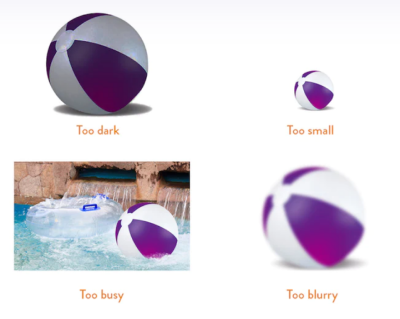
Lighting
Based on how you arrange lights, it may bring elegance to a photograph. Bright lighting improves the appearance and presentation of your merchandise. There is also no requirement to spend a lot of dollars. Natural daylight is the finest and inexpensive option. You may either walk outdoors and snap a photo, or you can just place a chair covered in craft paper next to the windows. The light source should be positioned on the very same side of the item as the camera, or somewhat to one side. Direct the light using a mirror to acquire beautiful photographs for your page.

Display recommended or related products
Display related goods that consumers might be interested in that complement the present offering or things that customers have ordered. This may be shown on a product package or even in the shopping basket to lead consumers to the goods that fit their needs, thereby motivating them to purchase products. This is one of the superb methods to cross-sell similar items.
Synopsis
Online buyers, in general, demand seamless experiences. It is not only about developing an app when designing but also about providing a best shopping experience which will turn inactive visitors into paying consumers.


